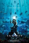
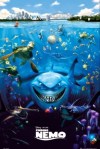
Where’s the difference?
The difference is that the Pixar poster didn’t use a Getty stock image, nor copypasted the same shark three times in the upper left. The folks at Pixar also understand how light works underwater, and properly applied that to the characters, so that they’re believably integrated into the scene, whereas squatting-Aqua-Slav up there is just slapped into the picture with minimal use of color filters, and contrast levels that are laughably incongruous. Plus, for a man that’s supposed to be underwater, his hair sure looks like it’s just being blown by a fan. And where the fuck is the sense of scale here? This looks like something out of a Zoobooks magazine taped to the wall of a 10-year-old’s bedroom in the mid 90’s.
…Sorry, but I just cannot get over how unbelievably lazy this poster is. The Asylum comes up with better posters than this.
